
Blinded by Simplicity or Guided by Beauty?
Symmetry in Physics and Design
When studying symmetry as a child, one example always seems to come up: butterflies. Kindergarteners are told to paint a wing on a paper, then fold the paper in half and watch in awe as the second wing appears and their butterfly comes to life.
Since this example is so ubiquitous, we grow up thinking that the meaning of symmetry is purely geometric: something is symmetric if you can fold it in half and both sides match. But the concept of symmetry extends far beyond shapes on a paper.
Physicists, especially particle physicists (such as the author of this piece), spend a good chunk of their lives thinking about symmetry and its consequences. However, the symmetry that physicists are concerned with is not visual, but rather mathematical. This kind of symmetry, since it’s quite different from the kind we are used to, is best illustrated with an example.
Consider the action of squaring a number, or multiplying the number by itself. If we take, for example, 22 we get 4. But that isn’t the only way that the squaring operation can yield 4. What about (-2)2? Since a negative times a negative gives a positive, this turns out to also give 4. In fact, what we realize is that any number that we could choose will give the same result when we square it as when we square its negative counterpart. In physicist speak, we might say that, “x2 is symmetric under the interchange of x with -x”.
Though this simple example may not suggest it, the consequences of mathematical symmetries like this one are vast. They are so vast, in fact, that physicists have come to rely on symmetry as a basis for constructing theories about the Universe.
In the opinion of some critics, however, that reliance has steadily evolved into an overreliance and physicists are being led astray by the very notions they created to help guide them.
Credit: Maximilien Brice/CERN
As humans we are inclined to look for patterns, a fact which was confirmed by Kevin R. Foster and Hanna Kokko, biologists at Harvard and the University of Helsinki, respectively. Their research demonstrated that when the cost of believing a false pattern is less than the cost of disbelieving a real pattern, we tend to favor the former. This of course depends heavily on the perceived cost associated with believing or not believing in a pattern, and we tend to assess those costs wildly inaccurately. The result is a broken system that pushes us to see patterns that aren’t actually there.
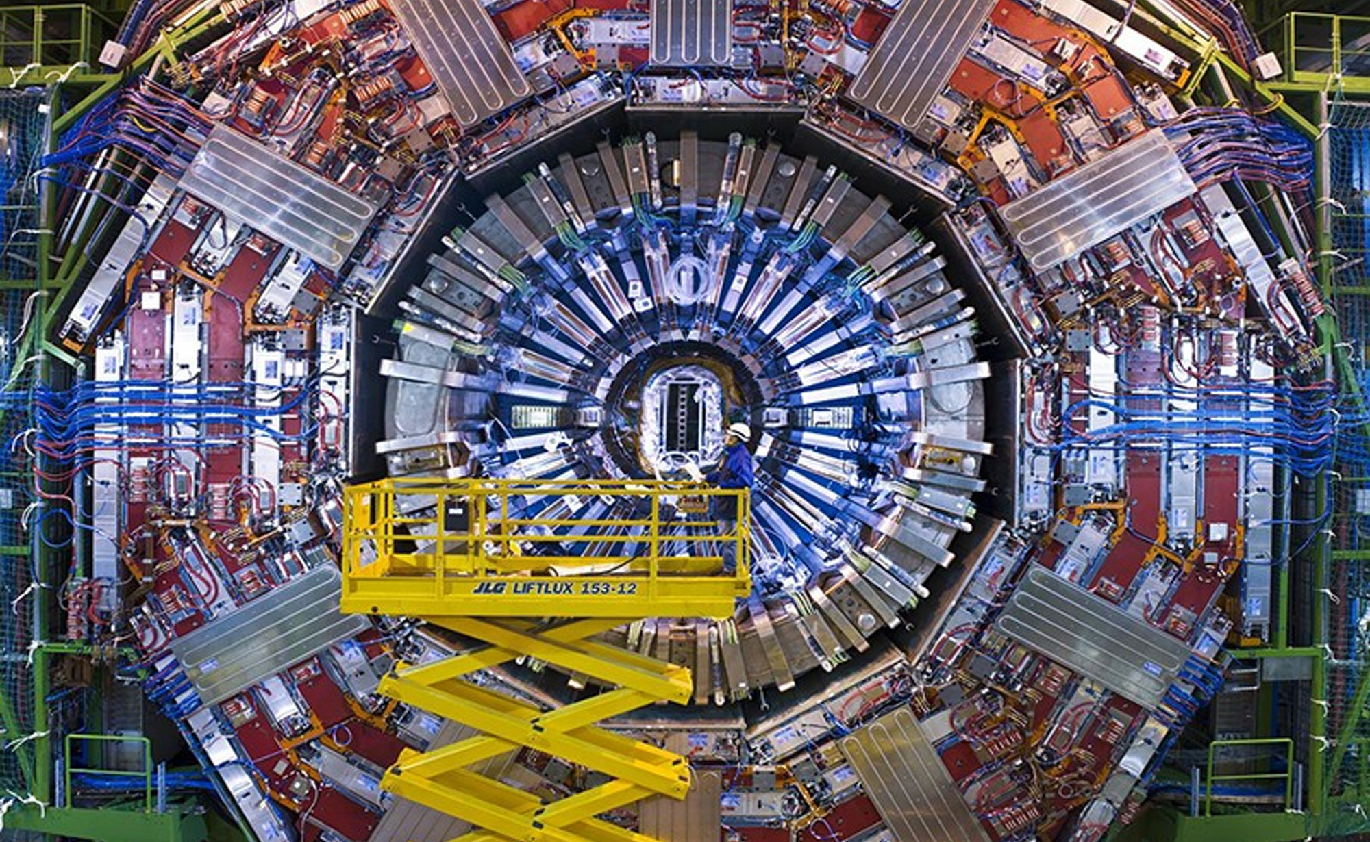
Physicists are no exception to this rule and in fact might be more guilty than nearly anyone else at devising false patterns. Particle physicists in particular are so fond of symmetry that in the early 70s they postulated “supersymmetry”. The theory proposed a supersymmetric partner particle for every single fundamental particle and sent physicists down a nearly 50 year rabbit hole. They built the Large Hadron Collider, the world’s largest particle accelerator and most expensive science project at the time, with the goal (among others) to search for those partner particles, and despite 12 years of operation, they have yet to be found.
All this begs the question of whether symmetry is a trap, luring us in the direction of arbitrary “beauty”, or if our intuitions about the way things seem like they should be are truly accurate. Is the expected answer, the most congruent one, likely to be the right one?
Broken Symmetries
In the 1960s, a Japanese physicist named Yoichiro Nambu proposed an idea that turned our understanding of symmetries in particle physics on its head. While studying superconducting magnets, he found that the physics we observe in nature is often the result, not of symmetries, but of broken symmetries. He learned that physical systems can evolve in such a way that they once fulfilled a symmetry, but later broke that symmetry, and that the system retains a memory of the symmetry it used to fulfill.
One simple way to think about symmetry breaking is to consider what happens if you briefly stand a pencil up on its pointed tip. We know, both from basic physics and experience, that it can’t stand like this for long, and it will eventually fall onto its side. If you perform this experiment in ideal conditions, for example in a room with no wind, can you predict which side the pencil would fall to? Put another way, if you imagined drawing a clock around the pencil while it is standing up on the tip, what time would it point to when it eventually falls down?

The obvious answer is that you simply can’t predict which way the pencil will fall. At some point, however, it will fall in some direction. When it was standing up, the system had a symmetry in that the pencil could have fallen anywhere along the clock; once it falls, that symmetry is broken, and the pencil has chosen a “preferred” direction.
The idea of a broken symmetry, and the arbitrariness with which the system (in our case, the pencil) chooses its configuration after breaking that symmetry, is one that runs counter to our expectations of finding patterns in nature. What we can learn from Nambu, though, is that when we look past our expectations of symmetry, new discoveries could be hiding just around the corner.
Symmetry in Design
Another field where the virtues and vices of symmetry have long been debated is design. Any introductory graphic design course will tell you that symmetry is one of fundamental principles of good design, and there are numerous examples of logos, webpages and more that display either perfect or approximate symmetry.
Psychologists agree that the human brain prefers symmetrical patterns to asymmetrical ones, and in fact the same has been observed in animals, such as bees, as well. Visual symmetry is often characterized as being soothing or calming to our minds, while asymmetry is seen as disruptive and chaotic.

Although it may seem that sticking within the bounds of perfect, reflectional symmetry could be a formula for always creating aesthetically pleasing designs, it can sometimes be the case that symmetry becomes a constraint instead of a tool. Because our brains are compelled to find symmetry in the things we look at, a design that already incorporates perfect symmetry is, in some sense, expected. For a design to really capture the audience’s attention, it may actually be to the designer’s benefit to employ asymmetry.
Asymmetry can allow a creator to draw attention to certain focal points of a given design, and it can give the design a sense of movement or dynamism.
Interestingly, sometimes the appearance of symmetry is not exactly aligned with its true, geometric definition. For example, in many music or video playing applications, you often see the play button – a triangle on its side – inscribed inside of a circle. To our eye, the whole shape, the triangle inside the circle, looks to be aligned perfectly. It turns out, however, that depending on how you determine the midpoint of the triangle, the set of shapes taken together can be perfectly, mathematically aligned, or slightly off. Interestingly enough, it is the option that is slightly misaligned that appears more satisfying to us, and thus is the one that is typically used in actual user interfaces. In this way, asymmetry can also be used to give a design the illusion of symmetry.
If not symmetry, then what?
Just because it is predictable does not mean that symmetry has to be fully abandoned to create an interesting design. If we want to satisfy the brain’s instinctive itch for symmetry but still create unique and enticing designs, a compelling alternative is to employ balance.
Another fundamental principle of design, balance is a concept similar to symmetry, but with some additional subtlety. In order to achieve perfect symmetry, two sides of a design must reflect each other exactly; in order to achieve sufficient balance, the two sides must simply feel like they reflect each other.
What exactly does that mean? If we think of each element of a design as having some visual weight – essentially the degree to which our eye is drawn to it – then the idea of balance is to create equal visual weight on both sides.

Take for example the homepage of our website: the design does not incorporate perfect symmetry akin to the wings of a butterfly. It does, however, make use of the principle of visual weight to achieve a symmetrical sense of balance. If you imagine dividing the page in half through the button labeled “Connect”, you can compare the visual weight of the two sides. Each side has two people (not counting the man in front who you’ve just sliced in half), making the visual weight about equal. The right side has one large tree, while the left has a small tree plus a bench – if the tree on the left were as large as the one on the right, the bench may create a sense of asymmetry, but instead the tree is smaller to preserve the delicate balance. The right side has the skyline, which is tall but narrow, while the left has a forested background, which is shorter but wider. If the design were folded in half, the two sides would certainly be far from identical, but by creating a visual balance, it gives the feeling of being symmetrical. Like the play button inside of a circle, this design appeals to our sense of symmetry without explicitly utilizing it.
Conclusion
From physics to design and everything in between, we are drawn towards techniques that help us simplify the complexities of the world around us. It is through this lens that we can understand our inherent pursuit of perfect symmetry, be it visual or mathematical. We have seen however, that perfect symmetry does not exist in all cases and it may not always be the answer to our questions.
Symmetry can guide us in the direction we need to go, but it is only when we look beyond that we find a deeper sense of creativity. In physics, that may mean looking towards the mathematical consequences of breaking symmetries, and in design it can mean loosening our definition of symmetry by aiming instead for balance. We can and should be led in creativity by the desire to achieve symmetry, yet still continue to explore the complexity that lies beyond it.
By Adriana Ghiozzi
A graduate of UC Berkeley and a current master’s student in particle physics, Adriana Ghiozzi has a long-held passion for science and scientific communication. Her work has appeared on energy.gov, ornl.gov and usiter.org. Adriana believes that science should be accessible to everyone and she works to embody that mantra in every piece she writes.