A Recipe for Infographic Success
How to Create Infographics that Inform and Inspire
As content creators, infographics sit at the intersection of practically everything we do. They combine a research project, a writing project and a design project all into one final product. If done well, infographics can serve as an efficient and entertaining way to explain complex ideas to your audience.
But with so many different pieces, how can you ensure that your infographic is effective? How do you balance writing copy that informs without boring, and creating a design that appeals without overwhelming? In this piece, we break infographics down into their constituent parts and illustrate how to maximize your infographic’s effectiveness in each category.
Part 1: Research
At the heart of an infographic, as the name suggests, is information. In a time where facts and truth have suddenly become disputed, it is crucial that information presented on an infographic is accurate, verifiable, and as free from bias as possible.
In order to achieve that goal, an infographic should comprise information from reputable sources. Whenever possible, cite peer-reviewed, academic research for statistical facts, especially if your infographic’s topic is scientific in nature. Depending on the topic chosen, facts or statistics that will be featured on an infographic should be corroborated – essentially if you find a fact on one website, try to Google the same fact and see if it appears in other places as well. When using information from studies and surveys, it’s always prudent to check what the funding source for the study or survey was; this way, you can gain insight into the possible biases that the results could contain.
Example of Effective Research:
(Every point presented in the infographic cites a study, a university professor, or a journal article)
Part 2: Copy
Most infographics are data-driven and quantitative, explaining some chosen topic by making use of statistical facts. The goal of an infographic, however, is not just to present your reader with a list of facts and figures, but rather to use those facts and figures to weave a narrative that will draw the reader in and stick with them long after they scroll past the graphic.
To do this effectively, copy should be clear yet concise. It’s crucial to strike a balance between an infographic with so much copy that your viewer is too intimidated to even read it, and one with so little copy that your message isn’t sufficiently communicated.
Just like an article or blog post, an infographic should have a main idea or thesis statement, and all of the information presented on the graphic should in some way support that main idea. It should be clear to your reader what topic the facts you present are relevant to, and ideally your reader should come away from the graphic convinced of the merits of your argument. The infographic should tell a clear and persuasive story.
Example of Effective Copy:
(The copy is concise and is organized so that you know what argument each piece is relevant to)
Part 3: Design
Like any other piece of content, infographics should follow the basic principles of good design, including pattern, repetition, white space, balance, contrast and movement. While all of these principles are undoubtedly important, we’ll break down the three that are most relevant to creating effective infographics.
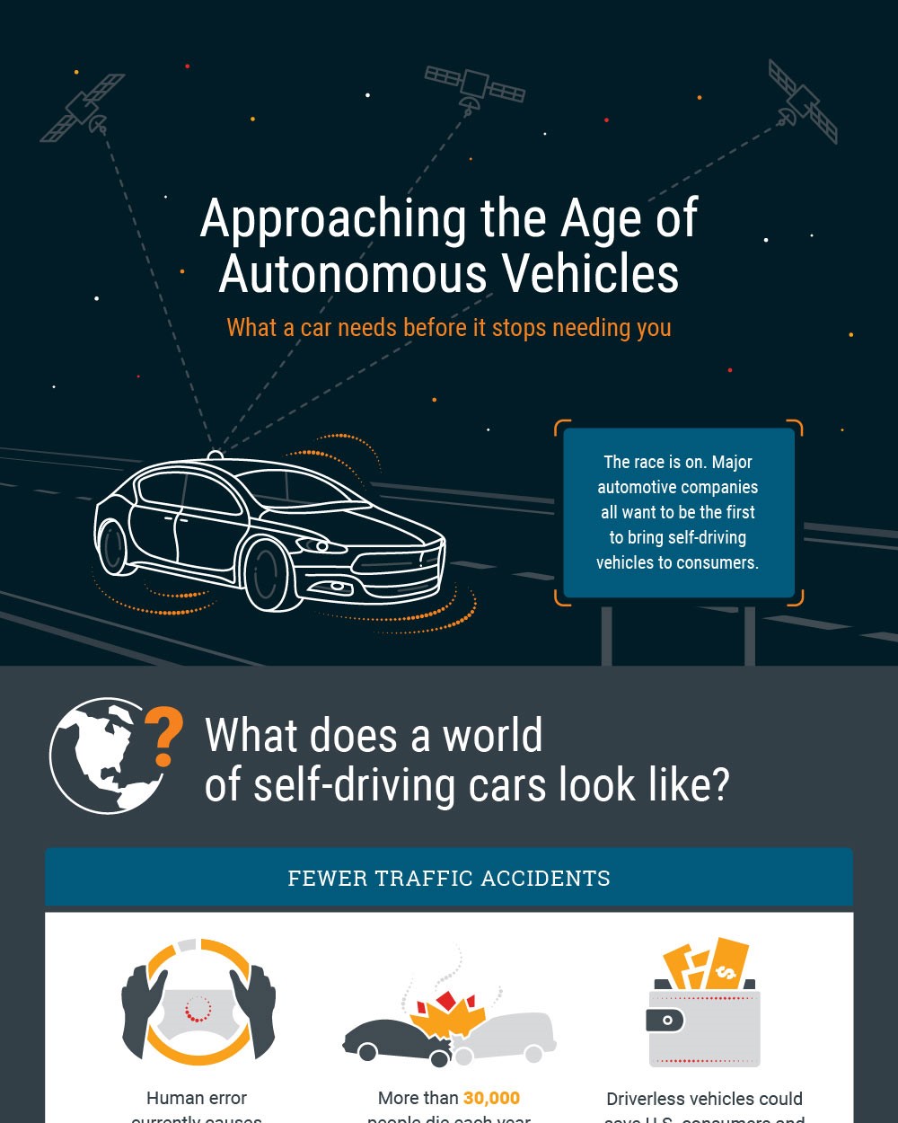
- Contrast: In order to get any traction at all, there is one very practical criteria that an infographic should meet: the text must be readable. The graphic could feature the most revolutionary and fascinating research, but if the reader has to squint their eyes to decipher it, they will scroll past the graphic without digesting anything. For this reason, contrast is a key principle in designing a graphic. Pragmatically speaking, this means ensuring that text color sufficiently contrasts with background color, while still maintaining aesthetic appeal. There is some debate on the topic, but most designers agree that in particular white text on a black background should be avoided because it can induce strain on the eyes.
Beyond copy, color contrast of a graphic’s various images can be used to draw attention toward certain facets of the argument. Strong color contrast can give a sense of urgency to a certain topic, and will immediately draw a reader’s eye, so use it wisely. Other types of contrast, such as shape or size contrast, can also affect the visual weight of the overall design.
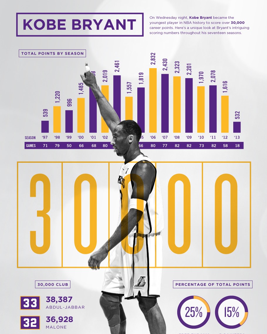
Example of Effective Contrast:
(The use of purple and yellow, two contrasting colors, as well as contrasting sized images to illustrate quantitative ideas make this graphic easy to read and understand.)
- Movement: A subtle but important principle of design, mastering movement will ensure that your reader fully understands the message your infographic is trying to convey. Movement refers to the path a reader’s eyes take through a design, based on what the focal points of the design are; it can be thought of as the flow of a design. In an infographic, it is not uncommon for the order of the text to impact the argument being presented. For example, your information might be chronological, showing the development of a certain person or phenomenon over time. Alternatively, you might present an argument that reads like a story, requiring understanding of the previous point to fully grasp the next one. In these cases and many others, you need to ensure that your design gives the reader a sense of the order in which they should read the text. This can be done explicitly, using a numbering system or lines to connect boxes of text, or more implicitly, using the Gestalt principle of proximity.
Movement can also be achieved more subtly by exploiting visual hierarchy. In design, visual hierarchy simply means structuring features in order of importance. By making use of bright colors, large text, and creative spacing, your design can guide the reader’s attention without the need for explicit lines connecting information.
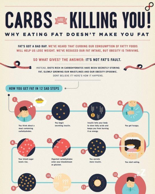
Example of Effective Movement:
(The lines help guide your eyes to read the text in the correct order, but they don’t overwhelm the design.)
- Balance: Because infographics necessarily contain a lot of text, it’s important that potential readers are not intimidated at first glance. In order to improve the digestibility and aesthetic appeal of the infographic’s information, achieving visual balance is crucial. This principle of design is often explained in terms of a seesaw – the person that is just slightly heavier can tip the seesaw entirely in their favor. Similarly, if one side of the design feels heavier than the other, whether because of bright colors, large text, or anything else, the reader’s attention will be drawn to that side and pulled completely away from the other side. This will impact the way your reader interprets the information contained on that heavier side, and could cause them to misinterpret your infographic’s central argument.
For an infographic, visual balance simply means finding the right combination of all the infographic’s various elements. Like any design, an infographic shouldn’t be overly reliant on text, but it can’t be exclusively visual either. Since an ideal infographic combines so many different elements into one synergistic piece of content, successful visual balance means that all of those elements are structured in a way that they complement each other.
Example of Effective Balance:
(Uses images on one side to balance out the text on the other side, which gives the graphic a very clean and organized look.)
Bonus section: Shareability
In addition to research, copy and design, there’s one crucial part of an infographic left that should be considered and incorporated at all steps in the process – shareability. When creating any content, it’s critical to think about the channels in which you’ll plan to share that content, and infographics are no exception. Often an infographic will be much larger than other pieces of visual content, simply because they contain such a significant amount of text. From the design perspective, this means that you should consider where you’ll plan to post before beginning the design process. An infographic that fits, for example, in an Instagram square or carousel will entail a significantly different creative process than one that will be posted on a scrollable webpage. From the research and copy side, thinking ahead about your preferred distribution channel will allow you to tailor your message to the particular audience you expect.
Conclusion
Creating infographics is both an art and a science. Doing so effectively requires attention to detail to accurately convey information, creativity to make that information digestible and aesthetically pleasing to read, and an understanding of human psychology to make the message resonate. Though the process of building up infographics can seem daunting, the final product is a unique way to inform and inspire your audience.
By Adriana Ghiozzi
A graduate of UC Berkeley and a current master’s student in particle physics, Adriana Ghiozzi has a long-held passion for science and scientific communication. Her work has appeared on energy.gov, ornl.gov and usiter.org. Adriana believes that science should be accessible to everyone and she works to embody that mantra in every piece she writes.


